One Site, Every Screen: Conquer Digital with Responsive Web Design Services

Audio : Listen to This Blog.
In this age of ubiquitous digital devices, responsive web design services are crucial for success on the web. By utilizing web design services that promote responsiveness, your website will effortlessly adjust to any screen, allowing you to unlock the full potential of your online presence.
Businesses have a dilemma: how to make their online presence visible on all devices?
Here we are with the game-changing Responsive Web Design (RWD). Responsive web design is more than a passing fad; it’s a movement toward a new way of thinking about how websites should work and how they can provide an excellent user experience across all devices.
What is responsive web design?
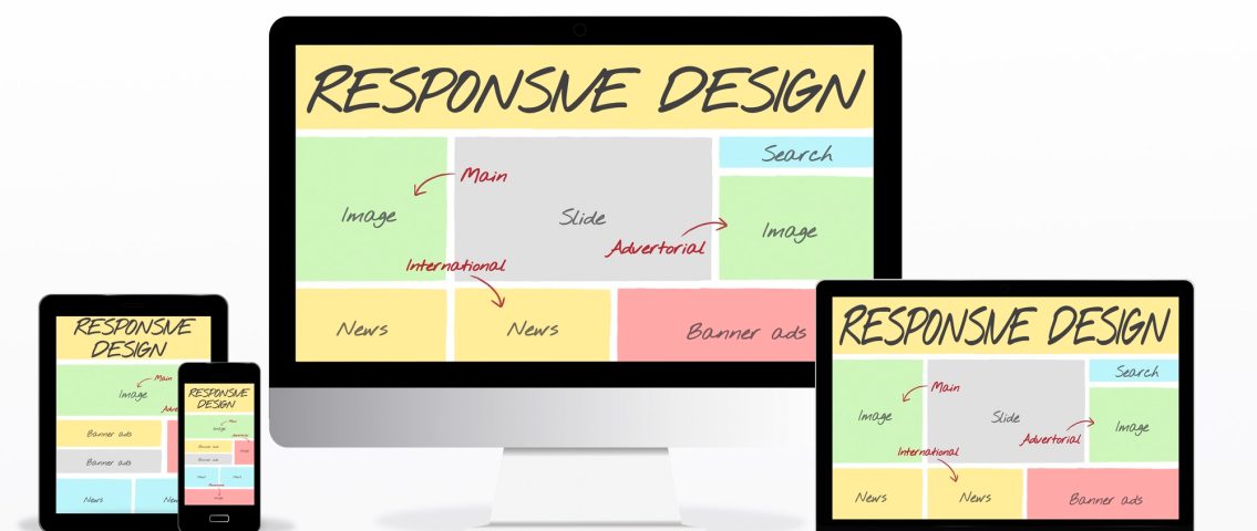
Responsive Design refers to a website that can adjust its appearance in response to changes in screen size and resolution, ranging from the largest screen on a desktop computer to the smallest screen on a mobile device. The excellent Ethan Marcotte was the one who initially presented this strategy in his post that was published on List Apart. The responsive web design approach, in contrast to other methods, makes use of CSS media queries and many cascading style sheets in order to modify the appearance of the website in accordance with the requirements.
Furthermore, you can have varied displays and layouts based on the orientation of the device. For example, with a tablet, the user may adjust the screen mode from landscape to portrait at their discretion. The purpose of this approach to web design is to provide the user with the most satisfying experience possible when it comes to the visual display of material on the device or platform that they are using to see it.
The following are the fundamental components of a responsive web design:
- Layouts that are grid-based and responsive
- Responsive Images
- Media Queries
RESPONSIVE LAYOUTS
Your page is no longer left to its own devices when you use responsive layouts. This method makes an effort to adapt the layout to a wide range of screen settings. A responsive layout adjusts to various viewing conditions and user requirements instead of relying just on the “most common” display size and an “average” user. The overall viewing experience may be improved by presenting alternative layouts that are optimized for each resolution range.
RESPONSIVE IMAGES
However, a responsive design goes beyond just altering the website layout. It makes sense that enabling photos to be adjusted is crucial, and there are two methods to do this: you can either dynamically crop the image or enlarge it proportionately. Responsive web design makes it possible for this to happen automatically.
MEDIA QUERIES
Media queries are a useful tool for creating incredibly mobile-friendly websites. With media queries, designers may create a variety of layouts using only HTML pages and select the appropriate style sheets according to various parameters, such as browser size and screen resolution. Thus, they take into account the device’s implemented capabilities rather than just its kind. However, this is only a cursory examination. By utilizing media queries, we are able to modify far more than just the positioning of an image. With the help of media queries, we can fine-tune our pages as they resize. For example, we can apply responsive typesetting to maximize the reading experience on the display that is supplying it, increase the target area for links on smaller screens, and show or hide elements to make the navigation more prominent.
Responsive Web Design: Adapting to the Digital Ecosystem
Responsive web design is a game-changer in the digital ecosystem. It involves creating websites that automatically adjust their layout and content based on the device accessing them. Whether viewed on a desktop, tablet, or smartphone, a responsive website ensures consistent functionality and aesthetics, providing users with a cohesive experience regardless of their chosen device.
Why Choose Responsive Web Design Services?
Mobile-First Approach: Catering to On-the-Go Audiences
With the proliferation of mobile devices, a mobile-first approach is imperative. Responsive web design services prioritize creating websites with mobile users in mind. This approach acknowledges the prevalence of on-the-go audiences and ensures that your website delivers a seamless and optimized experience for users accessing it via smartphones and tablets.
Enhanced SEO: Responsive Designs for Better Rankings
Search engines favor responsive websites. Google, in particular, considers mobile-friendliness as a ranking factor. Responsive web design services contribute to better search engine optimization (SEO) by providing a consistent URL and HTML, making it easier for search engines to index and rank your site. Improved SEO leads to higher visibility and increased organic traffic.
Cost-Efficiency: One Site for Every Screen
Responsive web design services offer a cost-efficient solution. Instead of managing multiple versions of your website for different devices, a responsive design allows you to maintain a single site. This not only streamlines maintenance but also reduces development and operational costs, providing a practical and budget-friendly approach to achieving digital excellence.
Our Responsive Web Design Services
- Expert Design & Development: Our team of talented designers and developers create stunning, responsive websites that are visually appealing and functionally intuitive on any device.
- Content Optimization: We ensure your content is optimized for readability and accessibility across different screen sizes and resolutions.
- Performance Optimization: We prioritize fast loading times and smooth navigation, resulting in a user experience that keeps visitors coming back for more.
- Cross-browser Compatibility: We test and ensure your website functions flawlessly across all popular browsers and devices.
- Ongoing Support & Maintenance: We’re here to help you maintain your website and adapt it to evolving trends and technologies.
Don’t let your website be confined to desktops. Unleash the power of Responsive Web Design and conquer the digital world, one perfectly optimized screen at a time.
Ready to take the plunge? Contact us today to learn how our Responsive Web Design services can help you build a website that truly delivers – on every screen, for every user.